
Parke X Target
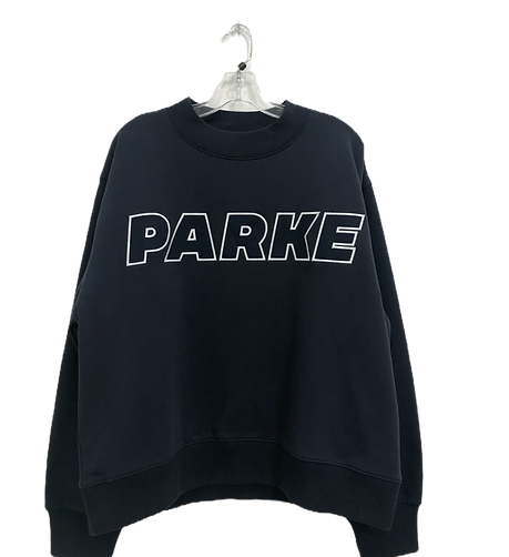
Parke partnered with Target to create a more accessible version of the brand’s elevated leisurewear aesthetic, translating premium $140 products into a $40 retail collection. The Spring/Summer drop featured coordinated sweat sets, graphic tops, and casual essentials designed for a broader consumer market.
Tools
Adobe Photoshop • Adobe Illustrator • CAD Development • Print/Embroidery Production • Trend Research

My Role
I contributed to the collection through:
-
Apparel graphics and embroidery artwork
-
Colorway development
-
Label and hang tag artwork
-
Production setup/spec sheets for factory communication
-
Sample execution while maintaining brand consistency


Design Approach
The design process focused on translating Parke’s premium aesthetic into an accessible retail collection while maintaining the brand’s established visual identity. Working closely alongside the fashion design team, I contributed to the development of graphics and embroidery artwork while collaborating on colorway direction and artwork sizing approvals before final garment selection and production.
Because the collection was developed for mass retail, all artwork needed to balance visual impact with cost-conscious production requirements. Simplified embroidery treatments were chosen to ensure manufacturing efficiency while still preserving the clean, elevated aesthetic associated with the brand. Through collaborative development and refinement, the final collection achieved a cohesive summer leisurewear feel across all garments and branded assets.


Outcome
The collection launched in mid-April and achieved:
-
80% sell-through within the first 48 hours
-
Successful translation of a premium brand into accessible retail
-
Strong alignment between trend-driven design and consumer demand